Control where people look using tonal values
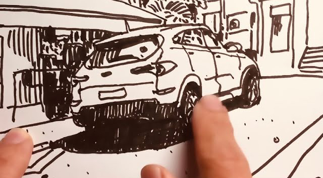
I found that tonal values isn't just about shading light and darks. It's also about allowing the artist to control where the viewer looks and in which sequence. I share 2 of my personal principles on how I use tonal values here. This is foundational to how I draw all my sketches and illustrations.
But you may ask, if you are manipulating the contrast, does it mean that you are not being 100% true to the scene you are looking at? (if you are drawing from observation). Yes, you aren't. But that's what storytelling is about- you play up what is important to the point of the story and play down the parts that are. But if you want to just document the contrasts in a scene exactly how you see them, you will have to choose and frame the scene very well (like a photographer does) so the contrasts are exactly where you want them. If not, viewers will not know what the focus or "point of your story" is. It's like a friend rambling on and on and you can't tell what the point he is trying make.
So you can either manipulate a scene so the focus point comes out clear. Or choose and frame a scene that already has a clear focus point (determined by the tonal value contrasts).
It's actually fun to spot these two principles at work in daily life. Look around you, and you will see it - The zebra crossing, the black and white suit, how the lights and darks are composed in a movie frame.
Try it out in your drawings. The best way to learn is to do.
Here are the books featured in this video:
LA/SF (Gosh! the price of this book his sky rocketed!)
Comments