For those who know me personally, you know that I have a bias against using digital media predominantly for illustrations. Whether it be digital ink pens, pencils, or paintbrushes, I usually find that they don't look like the real thing when I put them side by side. They may only get 50%-70% of the look right. When I'm flipping through a picture book or comic in a bookstore, just give me a few seconds of close inspection and I can usually tell if an artwork is done with digital media or not. Digital art usually has this look I relate to food cooked in a microwave. It has that microwave scent. Same with digital art! I can usually sniff it out quick. But I think things are slowly starting to change. People are making digital brushes that are starting to look almost indistinguishable (by my standards) from natural media.
This is one digital brush set that has passed my sniff test. And I was impressed with it. If you are new to painting, gouache is a creamy paint that can be opaque when applied thick and can resemble watercolour when diluted with water. It is pigment mixed with chalk. I'd use gouache instead of acrylic or watercolour when I want a flat, matt-looking painting. If I layer it, it can create very lush scenes. It is very versatile. The backgrounds from Studio Ghibli movies are painted with Nicker poster colours. Poster colour and gouache are pretty much the same thing.
So I bought this digital brush set and have been using it for 2 years now. I've even used them for work with satisfactory results. So the question is:
HOW DOES IT COMPARE WITH REAL GOUACHE?
I'll walk you through my experience testing it out.
This brush set is sold through a few websites.
1. Creative Market sells it for USD$19. But a commercial license is USD$21
2. Lisa Glanz's website also sells it for USD$19 with a commercial license included
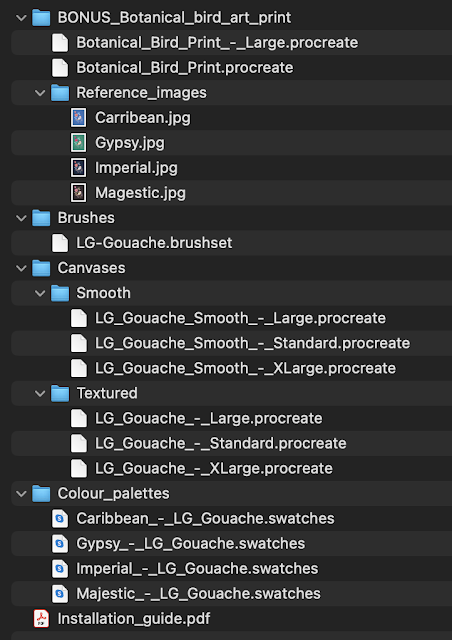
I purchased it on my iPad. Once purchased, the files were downloaded into my iCloud's download folder. Included was botanical bird art. It's basically a tutorial that might interest those who want to learn the brushes with step-by-step guidance from Lisa Glanz. The botanical bird files have instructions on how to draw the birds and then how to colour them using the palettes provided. If you like an orderly approach to trying out these brushes, you might like this. These are all the files in the download:
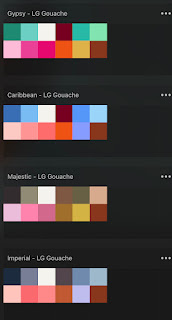
Provided are also colour palettes for colouring the birds.
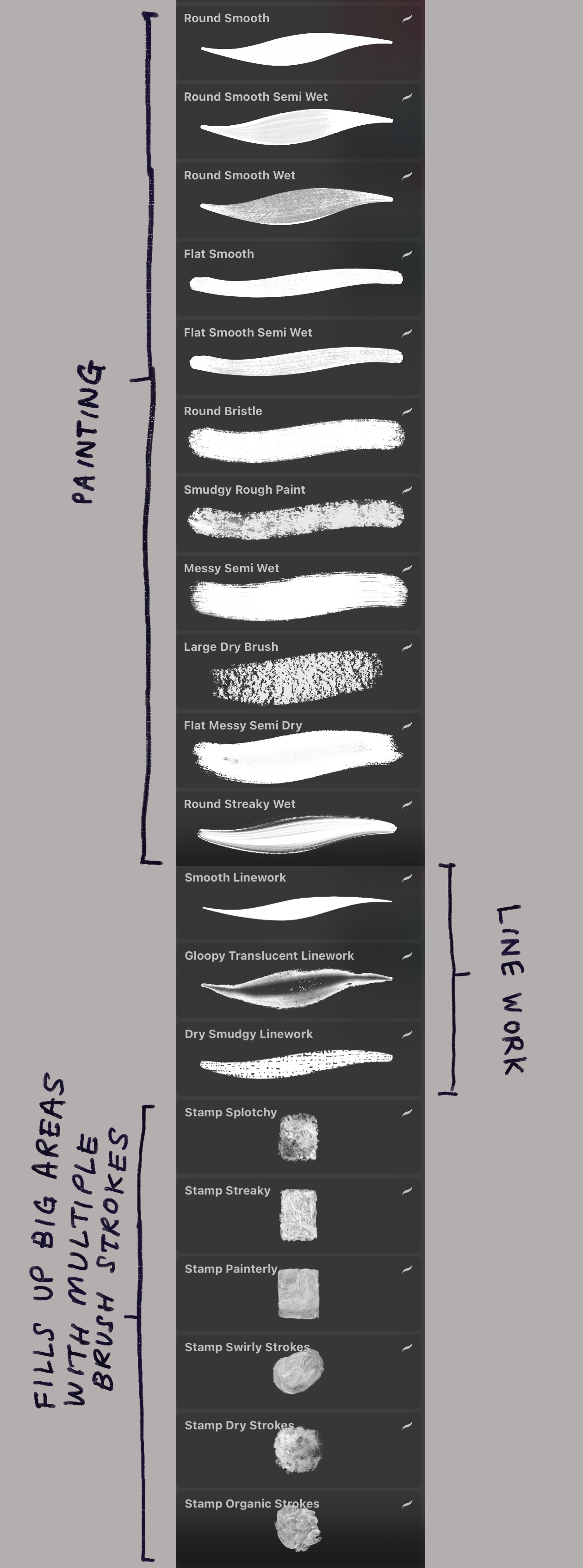
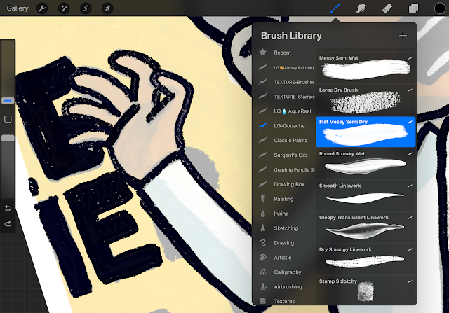
I skipped the birds and colour palettes. I like jumping in and trying it out without instructions, so I moved straight to the brushes and canvases! Just click on the brush set file and the brushes open up in Procreate automatically. These are the brushes in the download set. Some round, some flat, some rough, dry, wet.
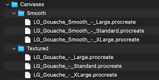
Unlike most other brush sets I've tried, these brushes MUST work with the canvases provided. The combination of canvas AND brush set is how these brushes look like natural media and sets them apart from other digital brushes. If you use these brushes without the canvases, you will not get the intended effect. These are the canvases in the download:
You get a smooth and textured canvas in 3 different sizes each.
The standard canvas is 23.71cm x 30.09cm, 300DPI
The Large canvas is 33.02cm x 41.91cm, 300DPI
The Xlarge canvas is 41.91cm x 59.27cm, 300DPI
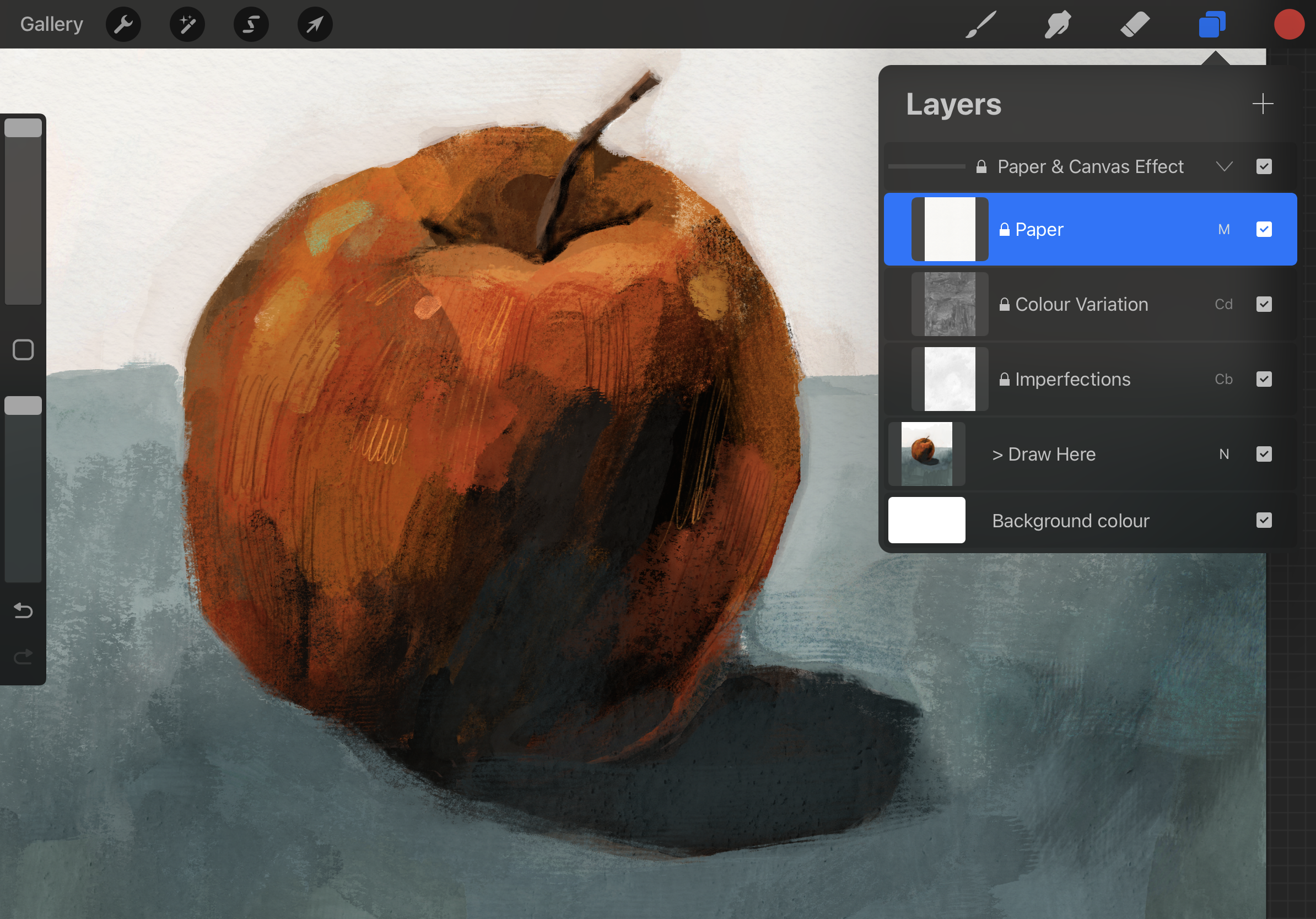
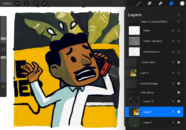
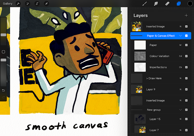
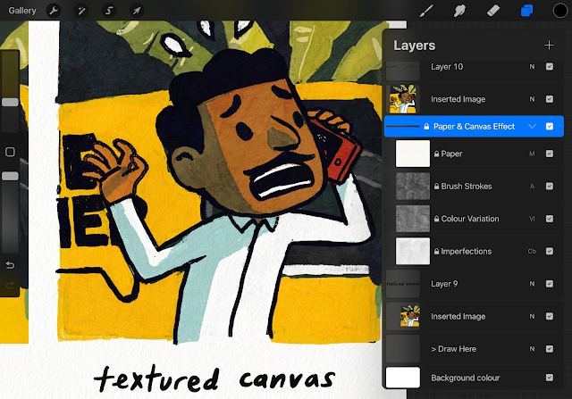
The canvases are basically layers of paper effects, colour variations, and imperfections set to different settings. The textured canvas has one extra layer of brush strokes. These layers are placed OVER your drawing/painting layers and that's what creates the magic.
This is my painting with the
smooth canvas layers applied over the "Draw here" layer. See a YouTube short video of this painting
HERE.
And this is the same painting with the textured canvas layers.
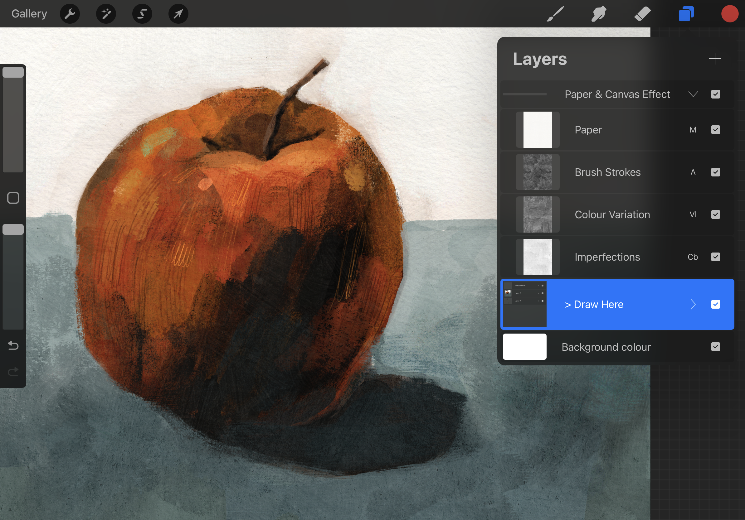
The textured canvas has, well, more textures. You can also customise each canvas layer. If you want the paper texture to be more pronounced, increase the opacity. You can't the blemishes to appear stronger, play with the opacity.
REAL GOUACHE VS EFFORTLESS GOUACHE TEST
To really see how it compares with the real thing, I imported a real gouache painting into Procreate on the left side and I painted the painting on the right with Effortless Gouache. I also show you what the same digital painting looks like under the smooth and textured canvas layers.
To me, this is very close! Even when seen very close-up, the small details make me think it is a real gouache painting. Would you be able to tell the difference if I did not label the pictures?
HOW I PAINT WITH THESE BRUSHES
1. I turn off the canvas effect layers. Why? Because I tend to use the eyedropper tool to pick colours from the painting and the canvas layers do alter the colours.
2. Next, I add a colour base layer. The paint brushes are not set to be completely opaque. They "pick" up paint from the layer underneath. So the background layer does play a part in the painting. I find that if I add a colour base layer, the painting comes together quicker. I like putting a dark colour as a base. It's something I might do with a real gouache or acrylic painting too.
3. Then with the canvas effect layers still off, I paint the colours and lines. Note that even with the canvas layers off, these brushes give off a lot of "blemishes", so it will be hard to use an eyedropper to pick an exact colour from the painting. It is best to pick your colours from a pre-set palette before you start painting. But if you like surprises, like me, you can stick with the eyedropper tool.
In this brush set, I didn't find a perfect line brush that would simulate the lines in my real gouache painting. So I had to alternate between the "smooth line work" (which didn't have the roughness I wanted) and the "flat messy semi dry brush" (which didn't taper). The line brush I really wanted is found in another Procreate brush set. But I will stick to this set for now.
4. When the painting is complete, I turn on the canvas effect layers to see the final effect.
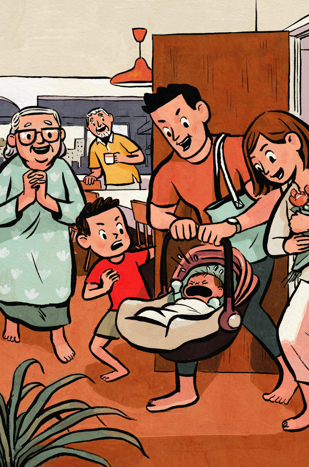
Here is an artwork I did for a picture book using real brush-inked lines and Effortless Gouache to do the colour layer. I liked how it turned out. I still like using real gouache but if a project needs very consistent colouring from page to page, this is a good digital brush set to get the job done quick!
CONCLUSION
Would I recommend this digital brush set? Absolutely! It does look like real gouache, even close up. But of course, I don’t get that tactile feeling of painting with a real brush since I’m using an Apple Pencil on an iPad screen. It isn’t going to make me give up using real gouache because the experience of painting with real paint can’t be replicated by a digital simulation, just like playing tennis on a game console can’t fully replicate actually playing tennis in a real court. But for projects where i just need to nail down that gouache look quickly, and keep colours very consistent from page to page, this is a very good option.




Comments