UNCOMFORTABLE + a neat way to mix colours for a comic (digitally)
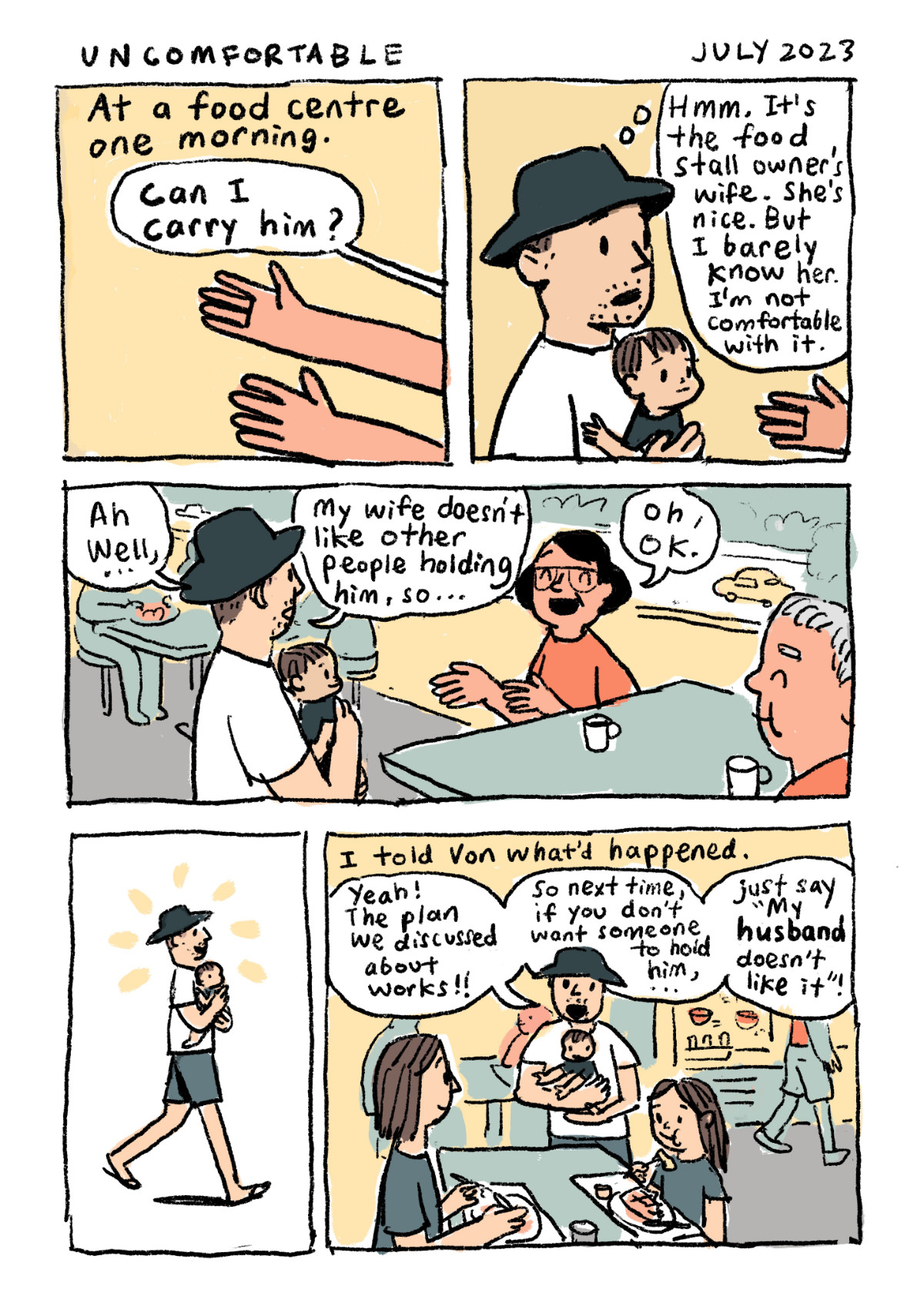
This comic continues a previous comic about people I don't really know coming up to me and wanting to touch my baby. As a parent, I feel uncomfortable with it because I don't know if the person might have harmful intent or if their hands are clean or if they might be carrying a virus. At the same time, I want to reject their advances as politely and respectfully as possible. I believe that most people just want to touch and carry a cute baby and they mean well. This comic covers one response that seems to work.
HOW TO MIX COLOURS FOR A COMIC
When I'm colouring a comic digitally. I usually pick and choose my colours intuitively. I try to avoid overly garish colours. I pay attention to whether a colour is warm or cool. I pay attention to how dark or light a colour is. I feel I'm pretty decent in choosing my colours even though it's by trial and error. So yeah, I don't really have a plan.
Then recently I was watching a Patreon video by Stephen McCranie who does Space Boy on Webtoons.(This is presently my favourite comic series. He also has it in the form of published books. So well done! Check it out!) In his video, he reminded me about the following technique. I realised that it's actually what I was already practising when I'm using real watercolours. I'd have just a few colours in my small watercolour palette. And I'd mix and match just those few colours to create all the other colours I'd need for a painting. But how do I mix paints digitally?
So I tried mixing my colours this way for the comic above. I used Procreate and the "Blackburn" brush that comes with the app. You can also do this with Photoshop, and Affinity Photo.
1. First, chose 3 primary colours- Red, yellow and blue. (Any shade, tint or saturation that you like).
2. Set your digital brush opacity to 50% and keep it like that for the rest of the mixing. The percentage of opacity is up to you. The opacity simulates the dilution of real paint with water.
3. Do a dab from each colour to achieve a mixed colour. Now you have secondary colours! And you will find that they look like they all belong together, like a family. That's because they came out from the same "parents"!
4. If you want a wider range of colours, go freestyle and try double dabs, mix colours with other mixed colours! Mix secondary colours with primary colours to get tertiary colours. Or just go crazy. See what you get!
At this point, I realised I also needed to pay attention to the tonal values (light and darks of the colours). I needed some very dark colours and also lighter colours so I could create contrast in my comic. Eg, I wanted my blue hat to be very dark so it would stand out against the lighter-coloured background. I'm a key character in the comic so my character should stand out. So I mixed black with the blues.
5. To create darker colours, do a few dabs of black (remember to keep your digital brush set at 50% opacity) into your colours. Conversely, if you want to lighten a colour, you could dab white into colours. See white and black as lightening and darkening agents. In a technical sense, black and white are not colours. They are shades. This was how I mixed my colours.
6. Try to keep it to a small selection of colours. This is called a limited palette. I've found that when I use a limited palette, my comic holds together better visually. I would even call it "pretty"!
This is the limited palette I got just from using my initial red, yellow and blue. And I added black as a darkening agent. Now have fun trying this for your own illustrations and comics!


Comments