Process: Creating illustrations for clients
Here is the process I used when I was creating the illustrations for Children's Season 2023.
1. Listen to what the client wants very carefully. This was over the phone. I often have to read between the lines because the client may not always articulate what they want in artist terminology.
2. Figure out the ONE simple message they want to convey. If they have a few messages, help them distil it down to ONE. In this case, it was about "museum visits inspire kids to be who they want to be or what could do in the future."
3. On scrap paper, I use a pencil and think of how to demonstrate that one message, visually. If I can't think of picture ideas, it means that my message isn’t narrowed down enough and I go back to refining the message. I find that brainstorming with physical paper allows my mind to think more clearly. Maybe doing it on a computer screen is too distracting.
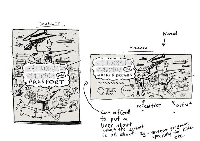
4. Get a mood board together using Pinterest. This helped me narrow in on the style and colours.
5. Produce quick sketches on paper or Procreate. I do this loose and quick. I don't spend too much time refining the lines. If it communicates the idea clearly enough, it’s good. Clarity is the goal! I also did a bit of a rough colour swatch test keeping it to a limited colour palette. I try to avoid using all the colours in the rainbow. I will explain more about that next time.

This here is probably refined 2-3 times from a rougher stage. I do refine it a bit before I email it to the client. I don't want them to go "Hur? What is this?" Clear, simple sketches help ideas get approved quicker. I do them in black and white too.
6. When the line sketches are approved, I do a quick colour test for myself as well as the client to see. If this work, I feel more confident that the final will turn out better. I can also gauge how much energy the illustrations have at this stage. For this project, the booklets are for kids, so I let the primary colours lead. It gave it a more fun, energetic feel.
7. Once that is approved, I focus on refining the lines and colours and textures. For this set of illustrations, I did it completely digitally and made use of Lisa Glanz's Delicious Texture Procreate Brushes. It gave the art a lovely picturebook-like warmth. After finishing the art using Procreate. Send it via Google Drive and I'm done!
Here's the booklet my daughter used. As well as the stamps we collected from the museums!


Comments